Advisor-Led Digital Onboarding Redesign
Internship Project Overview
During my internship with Northwestern Mutual’s Digital Product team, I was tasked with identifying an improvement opportunity within the company’s consumer website and mobile experience. My mentor encouraged me to explore the platform and propose a solution that would benefit both policyholders and the business.
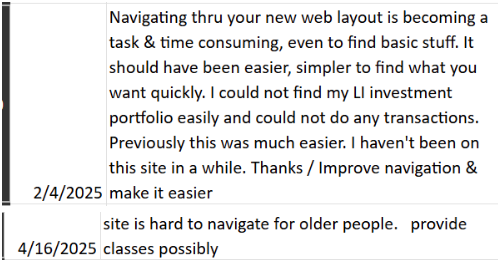
To better understand the experience, I conducted independent product exploration, participated in mobile bug bashes, attended digital product meetings, shadowed internal teams, and reviewed user feedback data. Through this process, a recurring issue became clear: users frequently struggled to navigate the platform and understand where certain actions could be performed. Alongside Internal analytics, my insights revealed an opportunity to redesign the onboarding experience so users could learn how to navigate the platform before exploring it independently.
Project Goal
The primary goal of this project was to design a more effective onboarding experience that would guide new users through the platform while introducing key features and financial concepts. By improving onboarding, the goal was to reduce confusion, increase engagement with the platform, and improve overall user confidence when navigating the digital experience.
Personal Contributions
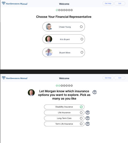
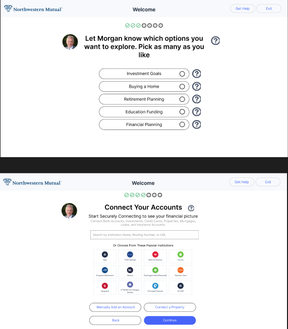
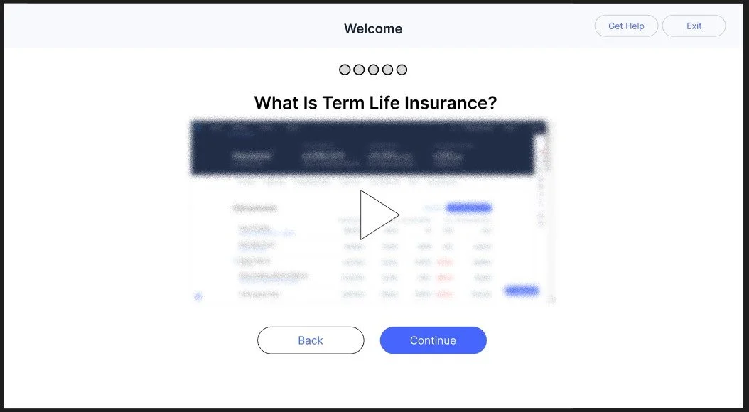
Within this project, I was responsible for researching, designing, and proposing a new onboarding concept. My work included analyzing Heap analytics data, reviewing user feedback tickets, and conducting user research through Disqo to understand onboarding expectations. I asked research participants questions such as what information is most important during onboarding for a financial platform and whether users preferred video guidance or written instructions when learning a new product. Based on these insights, I designed a video-guided onboarding flow where short clips introduce users to key features and explain financial concepts such as term life insurance while showing what those features would look like once accounts are connected.
Additional design improvements included:
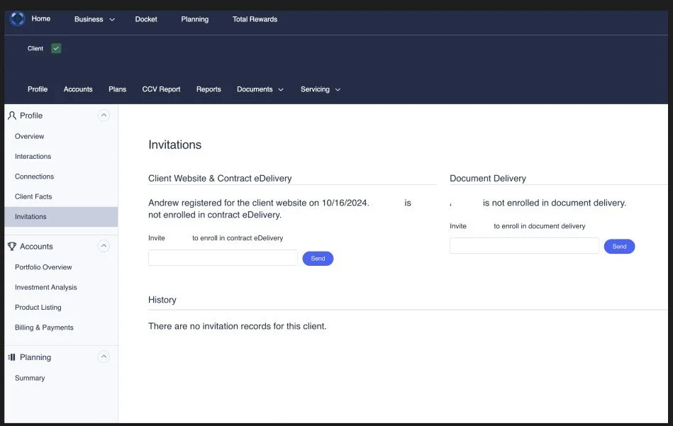
- An advisor-initiated onboarding process allowing financial advisors to start onboarding for new clients
- A redesigned advisor dashboard view to support the onboarding process
- A progress indicator using circular markers to show onboarding progress
- UI elements aligned with existing login and registration design patterns to maintain consistency
Project Results
The proposed onboarding redesign addressed several usability challenges by focusing on educating users before they navigate the platform independently. Insights from user testing indicated that participants strongly preferred video-based onboarding compared to text-heavy instructions. Based on this feedback, the concept introduced video guidance and clearer progress indicators to help reduce confusion around platform navigation and make the onboarding process more intuitive. While this redesign was presented as a concept rather than a launched solution, it demonstrated how guided onboarding could improve early user understanding of the platform.
Overall, this project strengthened my ability to translate analytics and user feedback into UX design opportunities, conduct user research to support design decisions, and prototype onboarding flows that balance business goals with user needs. It also increased my confidence in proposing user-centered solutions and communicating their potential value to stakeholders.
Example Onboarding Process (Blurred)
-
![]()
Real User Data
-
![]()
Pop-up Iterations
-
![]()
Original Flow
-
![]()
Original Flow
-
![]()
Welcome Pop-up Post Login/Registration
-
![]()
Example Flow Page 1
-
![]()
Example Flow Page 2
-
![]()
Example flow Page 4
-
![]()
Example flow Last page
-
![]()
Previous Onboarding Process Kick Start
-
![]()
New Onboarding Process Kick Start
-
![]()
New Onboarding Process Kick Start